Hi everyone,
I’m looking for help interpreting some CMAQ(v5.4) results I’m seeing. Specifically, the Canadian-dominant domain appears to significantly underestimate NOx levels.
Here’s the setup I’m working with:
-
I’m running a nested domain structure using 12US1 as the parent domain, followed by a 4 km domain and two 1.33 km domains nested within it.
-
Both high-resolution domains are fully within Canadian territory, while the 4 km domain includes a small portion of the U.S.
-
For the 12 km domain, I’m using all available 2019 input data from EPA and generating IC/BC for the 4 km domain from its output.
-
WRF data was generated specifically for our domains using the NOAH. SMOKE4.8.1 was used to generate the emissions from the 2019 emission platform.
-
I’m using the onroad AQ inventory for U.S. on-road emissions but not including any fire inventories.
I’ve attached my run_cctm script below for reference.
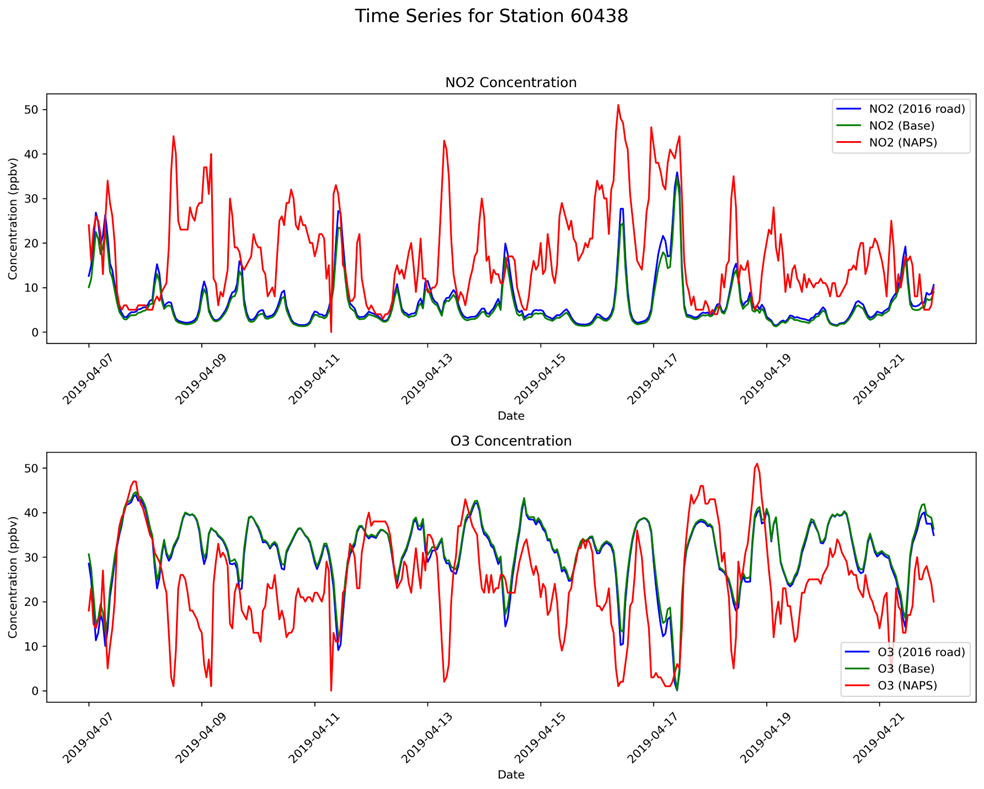
The plots provided are from a few selected NAPS sites from the April 4km simulation, and they clearly show the NOx underestimation.
Any insights into what might be causing this issue—especially related to emissions, boundary conditions, or model configuration—would be greatly appreciated.
Thanks in advance!
Sham
run_cctm_7day_2019_D02_megan.csh (38.1 KB)
Hi Sham,
I compared your evaluation results to a 12US1 2019 CMAQv5.3.2 simulation that we did for the EPA’s Air Quality Time Series (EQUATES) project. The EQUATES 2019 emissions are slightly different from what I think you are using and they did include fire emissions. Specifics on the model run (met, BCs, etc) can be found here https://doi.org/10.15139/S3/F2KJSK.
I noticed some similarities and some differences in our evaluation results for the NAPS sites 60438 and 61502 that may be helpful context for what you are seeing.
-
Our 2019 simulation also show a low NO2 bias in April, especially at the 60438 site near Toronto. (First 5 plots.) The large underestimation of NO2 at 60438 is consistent with the ozone overestimation at that site as it leads to less ozone titration.
-
When I compare the EQUATES timeseries plots to the timeseries from your post it looks like the diurnal patterns in your model results are shifted by a few hours compared to the observations. That is, the peaks and valleys of the model and observed values are offset, whereas we do not see this as much in our results. You may want to look at your post-processing workflow. Aligning the timing of these peaks and valleys should reduce your model bias, although clearly the model is still underestimating NO2, particularly the peaks.
-
We see this NO2 underestimation across different regions in our 12US1 domain in 2019 and in earlier years. For example the last 2 plots show monthly average NO2 at all NAPS sites and in the Northeast US. The negative bias is getting worse across time which has led us to hypothesize that the trends in our emissions inventories may be too steep in some sectors.
-
It is surprising that the NO2 values at 60438 in your 4km simulation are so much lower than the 12km model results. I would have thought that the 4km simulation in that urban area would have higher NO2 peaks than the 12km simulation since there is less spatial smoothing. Do you have a theory on why you are seeing this result?
I’m afraid I don’t have any more concrete suggestions but hopefully this reasures you that your model evaluation results are generally in line with other modeling efforts.
Hi Kristen,
Thank you so much for the detailed response — I really appreciate it.
I later found the issue with the time shift and have since corrected it.
The part I’m still struggling with is why the 4 km NOx concentrations are so low. To test this, I ran a simulation where I tripled the NOx emissions across the entire domain. The NO₂ concentrations also roughly tripled, and the total NOx concentrations remained about three times higher as well. This is not exactly what I thought would happen. I’ve included some examples below.
I’m not entirely sure how to interpret this — is this behavior considered normal?
I’ve been looking into a few more things to better understand the 4 km underestimation:
- Onroad emissions:
For U.S. onroad emissions, I used the AQ inventory. I’m now in the process of generating onroad emissions using the MOVES method. I don’t expect this change to have a major effect, but I’m curious — have you ever compared the two methods?
- Offroad T4 emissions:
I ran the 2019 inventory for one of our older domains, which previously used the 2016 inventory. In the 2016 offroad emissions, there are areas with significantly high NOx emissions that are absent in the 2019 inventory. Following this observation, I compared the annual total NOx emissions in Ontario for 2016 and 2019:
- 2016 Total: 50,362.90 tons
- 2019 Total: 36,877.10 tons
This shows a substantial decrease in NOx emissions between the two years.
I’m not sure if this alone explains the underestimation, but if you have any insights or suggestions for diagnosing whether it’s primarily emissions, meteorology, or something else that might be causing this, I’d really appreciate your input.
I did the following tests as well. Replaced the 2019 offroad inventory with 2016 and replaced both canadian onroad and offroad inventories with 2016. following are the overall results for NO2 and PM2.5 wrt to all 2019 inventory emissions.
The conclusion is that emissions aren’t what causing the under-estimation. please correct me if this isn’t right.
Could it be one of the following: 1. not using sea spray emissions 2. not using fire related inventories 3. meteorology (wrf)
thanks a lot for any insight.
Sham
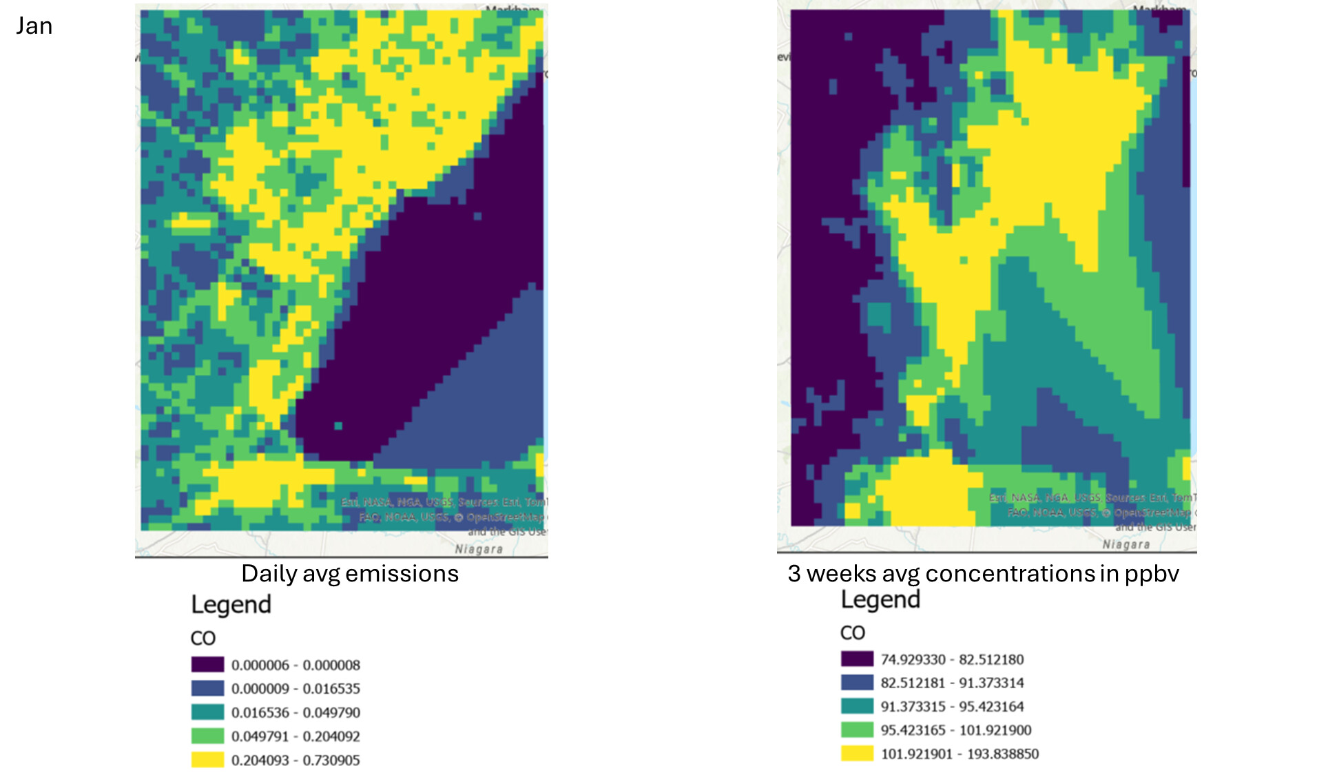
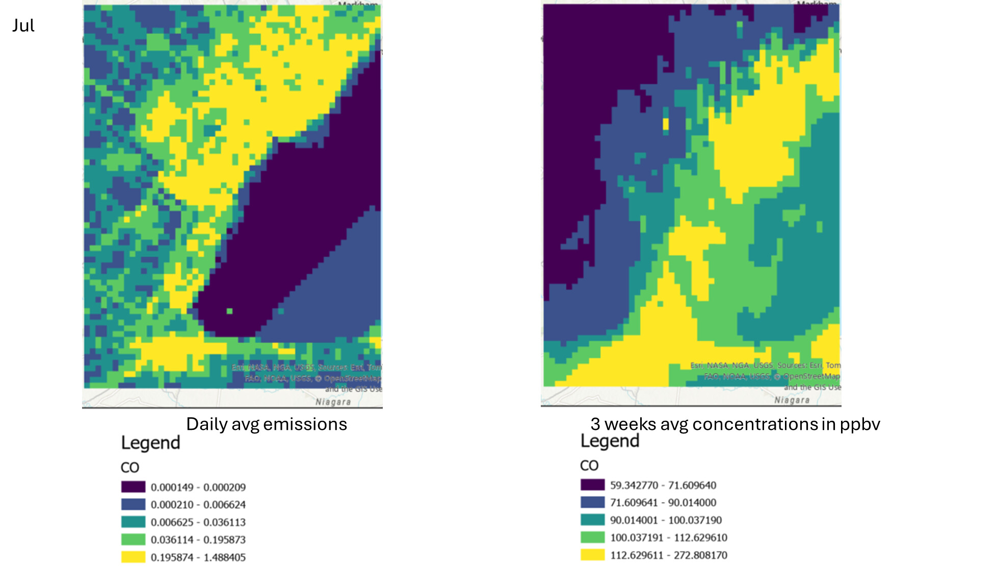
I am still struggling to find the reason for the underestimation of NOx. Following are the monthly averaged NOx over my 1.33km domain.
I also did the following plots to see the is the concentrations capture the same hotspots as emissions. basically to understand if this is something to do with emissions. Following emissions are without industrial (othpt sector) included.
Additional pollutants CO and EC are as below.
I’d really appreciate it if anyone has any thoughts on these and help me figure out this issue.
Thanks a lot.
Shayamila